Thursday 27 October 2011

piranesi

After a lecture on perspective in in which Piranesi was mentioned I got a book out of the library full of his work. I find them incredibly fascinating to look at. The way he uses perspective is intriguing especially in the last image of one of his imaginary prisons.


Little Blue bird

I made this for a friend. Didn't quite turn out as I had envisioned it but I like it none the less.

Tuesday 25 October 2011

Illustrator lesson number 3

Pattern, it was all about creating pattern today so i made an owl

Ok so the patterns aren’t that great and neither is the owl but I have many more sessions to go so hopefully future owls will be better.

Monday 24 October 2011

cubes cubes cubes

For a project we had to design 7 cubes based on a certain theme. Each cube also had to follow a certain rule. Before I made my final cubes, I created a number of mock ups. 
So before the main attraction here are the test subjects.


 Now for the main attraction... 


Stained glass cube following the rule of transparency and opacity

 CR Macintosh Rule: Cut out

  
Juan Gris Rule: Contrasting colours

 The English Civil war Rule: Pattern


Lucciane Day Rule: Texture 

Ancient Greek Rule: White with shadow
Joan of Arc Rule: Just type


Monday 17 October 2011

Saturday 15 October 2011

Thursday 13 October 2011

Charles Rennie Mackintosh

Originated from Glasgow he studied at the Glasgow School of Art in architecture. One of his main beliefs was that artists shouldn't be held down and should be given greater freedom and independence.
Mackintosh explored a wide range of art areas from jewelry to furniture, textiles and architecture.


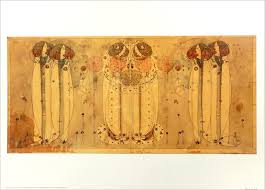
One of his more famous panels The Wassail
 Some more of his more renowned work includes the library at the Glasgow School of Art and his type face.


There are a number of interesting books out about Mackintosh. Two I recommend are Charles Rennie Mackintosh Textile Dsigns by Roger Billcliffe and Charles Rennie Mackintosh by Alan Crawford. 
Also visit  www.crmsociety.com

Wednesday 12 October 2011

Elli the elephant

I did this in my first Adobe Illustrator lesson.
Created in Illustrator only using letters

Sunday 9 October 2011

Saturday 8 October 2011

Dick Bruna

Whilst tidying my room at home a while back I found one of my old childrens books. And now in the past week whilst thinking about colour it sprang to mind. The first Miffy book was made in 1955 and to this day they still have an interesting colour combination. Bruna uses a lot of muted greens and blues fo his bakgrounds to make then fade into the background and creat distance. Whilst using brighter oranges and yellows to make things stand out.


However I find the way he reverses this quite interesting, using complementary colours to make them seem  brighter.

Thursday 6 October 2011

mood board of the 1940s

This is a mood board of the 1940's for my contextual studies.
Keep calm and carry on chaps!

Tuesday 4 October 2011

Picturing and poeting and pigs


 I have been looking through Alan Fletcher's book Picturing and Poeting for inspiration for my new project. The sheer amount of playfulness in his work Is fascinating. But one thing that caught my eye is his use of colour. 


These images are a small sample from his book. I like the way he subtly uses different shades of red in the Green image which makes you notice  certain some letters first.


And here's the Pig. Great use of different texture and colour.


Monday 3 October 2011


Doing a bit of research for my new brief on moving type and found this. It uses colour and composition really effectively and most important of all is really entertaining to watch.


Somthing else interesting to look at is Stephen Fry Kinetic Typography - Language  http://www.youtube.com/watch?v=J7E-aoXLZGY

Saturday 1 October 2011

Alex Trochut


A popular designer/illustrator/typographer who takes full advantage of what type can offer.
His work can be seen on http://www.alextrochut.com
Also if you like his work Craig Ward is worth looking at to.