Thursday 15 December 2011

The Gallery Liverpool

Header for the exhibition on the website.
For a recent project we were designing promotional banners and posters for an exhibition about 2000 years of shoes. One major thing about designing promotional pieces is that they must have a common consistency. So as a blog activity we were asked to look at gallery promotional prices for an on-going exhibition. So i looked at the Liverpool Art Gallery, the exhibition is entitled  Unauthorised Realities


This is the web page for the exhibition itself

The consistencies on the web pages are the use of the artist’s work Naive John which also carries on to his page on the Gallery web site. Other consistencies include the same clear font throughout as well as a continuing colour scheme. 
With the promotional poster that artists work is still used as well as a similar if not the same clear font.

Thursday 8 December 2011

its christmas!

So it’s the 8th of December time to make some charismas card I think. Only one problem is my printer has run out of colour. So what Christmas card design can I do that’s cute and in black and white. My first though was a penguin but that’s a bit boring without the yellow tummy. So the only other white thing that was cute and fluffy was a polar bear. So happy Christmas people and here is this year’s Christmas card.

Monday 5 December 2011

the dm

Short for the Dr Martens.

Whilst doing my shoe research for the last couple of projects which were, well bases on shoes. I did a bit of research on the DM seeing as I own a pair. The first website I looked at was the DM website which has a very informative page about their history and how they were invented which is quite an interesting tail.   http://store.drmartens.co.uk/t-history.aspx It also includes this video.
I also looked at how they were made and the different components which make them so darn comfy (after the 2 month wearing in period which can involve some pain). http://www.drmartensforlife.com/for-life-products/
 I also looked a book published about DM's by Dr Martens (there all about advertising and promotion) which talks a lot about the DM's role in culture which was quite interesting.  ) Heres a link to buy it on Amazon http://www.amazon.co.uk/Dr-Martens-AirWair-Ltd/dp/B001J1JUXC/ref=sr_1_10?s=books&ie=UTF8&qid=1323095883&sr=1-10 )
Dr Martens (Dr Martens)
Dr Martens are currently running a 'First and forever' campaign where you can talk about you first ever DM's which I must admit I think is a bit weird but here’s a video from their website promoting the campaign.

Wednesday 30 November 2011

Website idea

This is a quick idea for my home page for my website which I will be making next year.
I put it together in one of my illustrator lessons, think it might need a bit of improving before it gets put up on the world wide web.

Thursday 24 November 2011

elizabeth perry

After a recent lecture in which she was featured in I had a look at more of her work on her website, and I really liked it. Her line drawings especially carry conviction and smoothness. She also arranges her images on the page in interesting ways. Her watercolour studies are also fascinating especially the ones of objects with shadows.


She dose daily drawings in a sketchbook which she uploads onto her website http://www.elizabethperry.com/woolgathering/ definitely worth a look.

Shoe work in progress


The above two images were inspired by Anne Magill and her dry brush technique.


Wednesday 23 November 2011

If the shoe fits

My latest project is all about Primary research and how you have to know about something before you can design for it. The object that I have to focus on is the shoe. As well as well as drawing and painting some of the images have to be done using photography, these are just a few of the photographs I have taken looking at shoes.

Bit of experimenting with close cropping


In the above two images i was looking at lighting and filter effects.


Adobe Av after effects

On project I had to do a while ago was produce a story board for a short 10s film.  This film was then to be created on After Effects. Unfortunately I have had a few problems getting to grips with the program (I think it hates me), but here's a screen shot of my work in progress. 

Monday 21 November 2011

Tuesday 15 November 2011

Work in progress

I have a new brief in which we have to explain to a alien how an object works. I chose an umbrella.
For this project though we have to use Illustrator. Which looking at my other illustrator work I was a bit nervous about. Oh and we can’t use words just images which makes it even harder.


Thus is a screen shot of my work in progress


Tuesday 8 November 2011

close cropping

A recent brief was on close cropping of an image and the was different effects can be achieved by how you crop an image. These are some attempts of close cropping some photos that I took lats week.


Here I just cropped the surroundings do you don't know what the cat is looking at.

Cat's eyes

Here I cropped of the mans head so it creates a air of mystery
 about who the person is and what he doing with a hores.
 
Got this idea from Hiroshige pf just looking through the legs


The clocks ticking..

Yes another illustrator lesson this time its the pen tool and rotating objects.

Wednesday 2 November 2011

Egon Schiele

Schilele dose a large amount of work based on the study of people (some rather rude). But what I find interesting about his work is the way he composes his pictures.
In quite a few of his pieces Schiele crops of the top of the hair and/or the legs.

Standing Female Nude In A Blue Robe - Egon Schiele - www.egon-schiele.net

This close cropping makes for an interesting composition and helps the image to sit comfortably on the page.
Sitting Woman with Legs Drawn Up - Egon Schiele - www.egon-schiele.net

personal work

Here are two bits of personal work I did at the weekend. Just played around with gouache, first time I have ever really used it. Need a bit of practice.

Add caption

Thursday 27 October 2011

piranesi

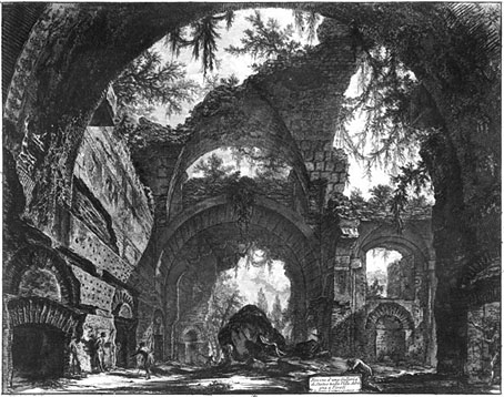
After a lecture on perspective in in which Piranesi was mentioned I got a book out of the library full of his work. I find them incredibly fascinating to look at. The way he uses perspective is intriguing especially in the last image of one of his imaginary prisons.


Little Blue bird

I made this for a friend. Didn't quite turn out as I had envisioned it but I like it none the less.

Tuesday 25 October 2011

Illustrator lesson number 3

Pattern, it was all about creating pattern today so i made an owl

Ok so the patterns aren’t that great and neither is the owl but I have many more sessions to go so hopefully future owls will be better.

Monday 24 October 2011

cubes cubes cubes

For a project we had to design 7 cubes based on a certain theme. Each cube also had to follow a certain rule. Before I made my final cubes, I created a number of mock ups. 
So before the main attraction here are the test subjects.


 Now for the main attraction... 


Stained glass cube following the rule of transparency and opacity

 CR Macintosh Rule: Cut out

  
Juan Gris Rule: Contrasting colours

 The English Civil war Rule: Pattern


Lucciane Day Rule: Texture 

Ancient Greek Rule: White with shadow
Joan of Arc Rule: Just type


Monday 17 October 2011